This article is part of our complete Wix guide and our list of best Wix apps.
Product options are where a browsing visitor becomes a buyer. The shopper likes the product, now they have to pick a color, a size and maybe a style. If that step is confusing, slow or full of surprises, they leave. If it is clear and quick, they add to cart.
This guide is a practical checklist for Wix product options: how to name them, how to display them, how to handle sold-out variants and prices, and what works best on mobile. Along the way we show how Variation Swatches & Options by MIVAQ Apps handles each point, but you can apply the ideas to any Wix store.
See Variation Swatches & Options on the Wix App Market →
Key takeaways
- Name options and values in plain words customers use, and keep their order logical.
- Show colors and patterns visually with swatches, and sizes as tappable buttons.
- Update the price for each variant and make sold-out choices obvious before the shopper picks them.
- Answer sizing questions on the page with a size guide to cut hesitation and returns.
- Design for phones first, because most store visits are on mobile.
In this guide
- Common product option mistakes
- Name and order your options well
- Colors, patterns and photo swatches
- Sizes and other text options
- Sold-out choices and variant prices
- Stock messages that build trust
- Add a size guide on the product page
- Mobile tips for product options
- Examples by store type
- Product options checklist
- How better options reduce returns and support tickets
- A simple process to improve your option pages
- Frequently asked questions
Common product option mistakes
Before improving anything, check your store for these common problems:
- Hidden choices. Options inside dropdowns that shoppers have to open to understand.
- Vague names. Values like “Color 1” and “Color 2” or internal codes such as “BLK-01”.
- Surprise prices. A bigger size or premium finish that costs more, but the page price does not change.
- Dead ends. Sold-out sizes that can still be selected, ending with an error message.
- No sizing help. Shoppers guessing their size and returning items that do not fit.
- Tiny tap targets. Small links or crowded dropdowns that are hard to use on a phone.
Each of these costs sales. The good news is that all of them are easy to fix.
Name and order your options well
Good option design starts with good data in Wix Stores:
- Option names: use simple labels such as Color, Size, Fit, Material or Length.
- Value names: use the words your customers use. “Navy” beats “Dark Blue 2”. If you use creative names like “Ocean Mist”, make sure a swatch shows the actual color.
- Order: sizes from smallest to largest, colors from most popular or from light to dark, and the most common choice first.
- Consistency: use the same option names across all products so filters and swatch settings work the same way everywhere.
If you need to rename many products or values at once, a bulk editor saves hours. Our guide to bulk editing Wix products and prices shows how.
Colors, patterns and photo swatches
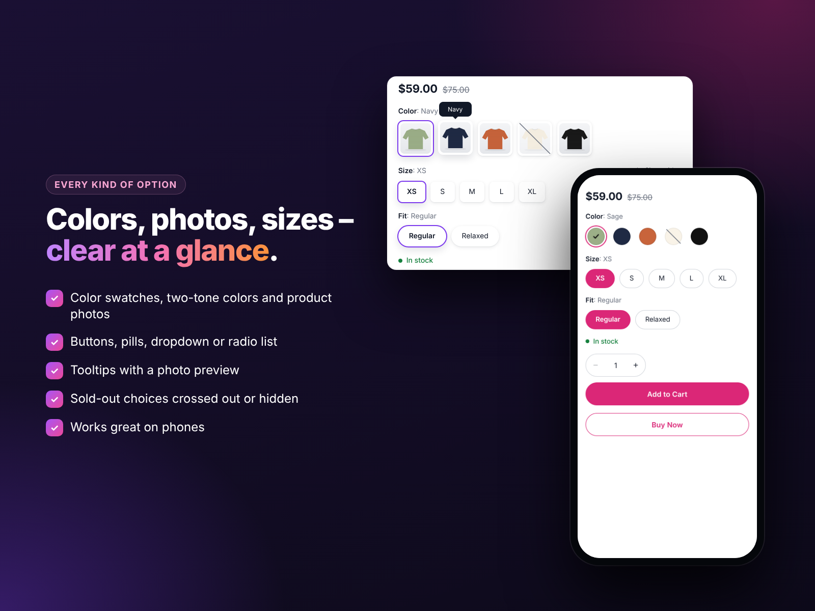
Color is the option where visual display matters most. A color swatch lets the shopper compare every shade in one glance and pick in one tap.
- Plain colors: use color swatches. Variation Swatches & Options pulls colors from your products and recognizes common color names automatically, so most colors are right from the start.
- Two-tone colors: show both colors in one swatch for items like “Black / White”.
- Patterns and materials: use image swatches (Pro), small photos that show stripes, florals, wood grain or fabric texture.
- Tooltips: show the color name, or on Pro a photo preview, when a shopper hovers or taps.
Sizes and other text options
Text options do not need images, but they still deserve better than a dropdown:
- Buttons for short values such as XS to XXL, 6 to 12 or 250 ml to 1 L.
- Pills for slightly longer labels such as “Regular fit” and “Relaxed fit”.
- Radio lists for options that need a short description, such as packs or bundles.
- Dropdowns only when there are many values, for example 25 ring sizes.
In the app you choose the style for each option separately, so one product can show Color as swatches, Size as buttons and Fit as pills.
Sold-out choices and variant prices
Two things build trust on a product page: honest availability and honest prices.
Sold-out choices. Cross out unavailable variants, or hide them completely if you prefer a cleaner look. Shoppers instantly understand what they can buy and never pick a size you cannot ship.
Variant prices. If different variants have different prices, the page should show the live price the moment a shopper chooses. Variation Swatches & Options updates the price for each variant and keeps Add to Cart right next to the choices, with a side cart so shoppers can continue browsing.
Stock messages that build trust
A short message like “Only 3 left” helps shoppers who are undecided. Used honestly, it creates real urgency and also explains why a popular size might disappear soon. On Pro, the app shows stock messages based on your actual inventory. Avoid fake scarcity: if customers notice that every product always has “only 2 left”, they stop believing your store.
Add a size guide on the product page
Sizing doubts are one of the main reasons shoppers hesitate and one of the main reasons for returns. Put the answer where the question appears: a size guide link right next to the size buttons.
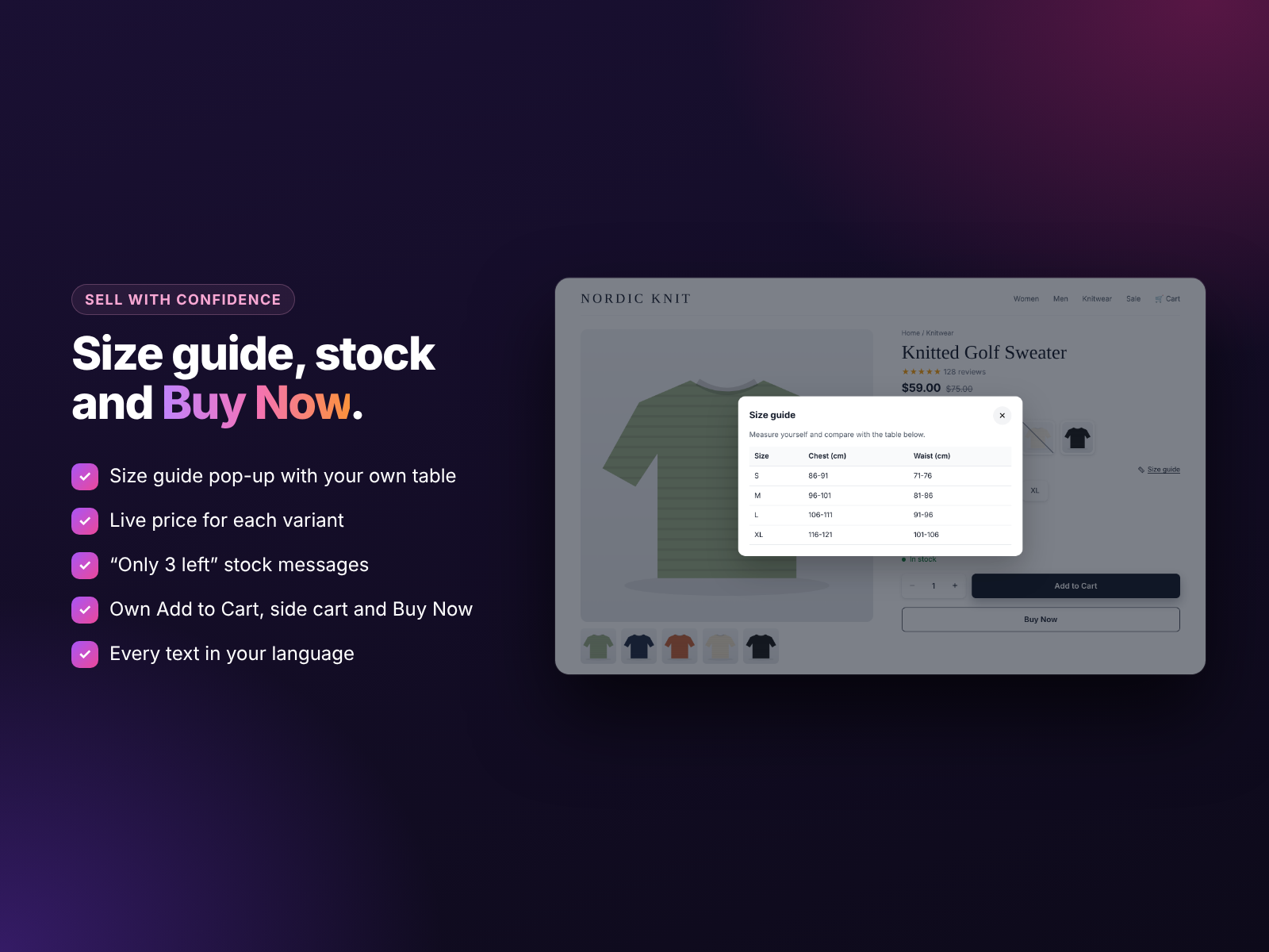
With the Pro plan you add your own size table, and shoppers open it in a pop-up without leaving the page. Include measurements in both centimeters and inches if you sell internationally, and add a short note about fit, such as “runs small, size up”.
Mobile tips for product options
- Big tap targets. Buttons and swatches should be easy to hit with a thumb.
- Short labels. Long values wrap badly on small screens. Use pills or a radio list for long text.
- Keep Add to Cart close. The shopper should not need to scroll far after choosing.
- Test real devices. Check your top products on at least one iPhone and one Android phone.
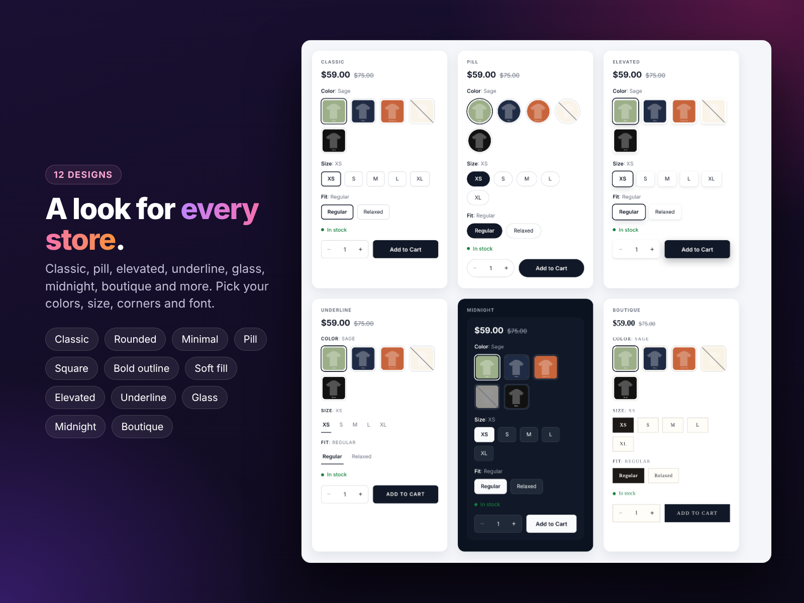
All 12 designs in the app are built to work on phones, and you can preview them on your own products before saving.
Examples by store type
- Clothing: color swatches, size buttons, a fit option as pills and a size guide.
- Furniture: image swatches for fabrics and woods, a dropdown for dimensions and live prices for each size.
- Jewelry: image swatches for metals, a dropdown for ring sizes and stock messages for limited pieces.
- Electronics accessories: color swatches for finishes and buttons for capacity or model.
- Beauty: color swatches for shades and buttons for sizes such as 30 ml and 50 ml.
Product options checklist
- Option names are simple and consistent across products.
- Values use customer-friendly names in a logical order.
- Colors and patterns are shown as swatches or photo swatches.
- Sizes and short values are tappable buttons.
- The price updates for each variant.
- Sold-out variants are crossed out or hidden.
- Stock messages are accurate.
- A size guide sits next to the size choice where relevant.
- Add to Cart is close to the options.
- Everything is tested on mobile.
Want a detailed setup walkthrough? Read how to add color and image swatches to Wix product pages. Planning a sale on many variants? See our guide to running a Wix store sale in bulk.
How better options reduce returns and support tickets
Good product options do more than lift conversions. They also cut the work that comes after the sale.
- Fewer wrong sizes. When the size guide sits next to the size buttons, customers choose the right size the first time. Every avoided return saves shipping, handling and often a lost customer.
- Fewer “is this in stock?” emails. Crossed-out choices and accurate stock messages answer availability questions before they are asked.
- Fewer color complaints. Photo swatches show the real fabric, finish or print, so what arrives matches what the customer expected.
- Better reviews. Customers who get exactly what they chose leave better reviews, and those reviews bring the next customers.
Track this after you change your option design. Compare return reasons, support emails about sizes and colors, and add-to-cart rate for your top products over the following weeks. Most stores see the biggest gains on their best sellers, so start there.
A simple process to improve your option pages
- List your top 20 products by visits. These pages matter most.
- Clean the data: fix option and value names, order sizes correctly and add prices for variants that cost more.
- Choose a display per option: swatches for colors, photos for patterns, buttons for sizes.
- Add help where shoppers hesitate: a size guide, a fit note or a material description.
- Check every product on mobile and fix anything hard to tap or read.
- Roll the same setup out to the rest of your catalog once you are happy with the result.
Try it on your store
Variation Swatches & Options has a free plan with color and button swatches, dropdowns, Add to Cart and 3 designs. Pro adds image swatches, pills and radio lists, all 12 designs, photo tooltips, stock messages, the size guide and Buy Now for $2.99 a month, or $1.99 a month billed yearly. Install it from the Wix App Market. Need a full store redesign? See our Wix services.
Frequently asked questions
How many options can a Wix product have?
Wix Stores supports several product options per product, such as color, size and material. Check the current limits in your Wix dashboard.
Should I hide or cross out sold-out sizes?
Crossing out shows that the size exists and may come back. Hiding keeps the page cleaner. Both are available in the app.
Do swatches help SEO?
Not directly, but better product pages can improve engagement and sales, and clear option names help shoppers understand your products.
Can each option have a different style?
Yes. You can show color as swatches, size as buttons and fit as pills on the same product.
Will the price change when a variant is selected?
Yes. The app shows the live price for each variant.