This article is part of our complete Wix guide and our list of best Wix apps.
Many Wix sites spend money on ads and SEO to bring visitors to the pricing page, then lose them there. The prices may be fine. The way they are shown is not: too many plans, unclear differences, no recommended option and no button that leads straight to payment.
Here are the top 15 pricing page tips we use when we design Wix sites for clients, with simple examples you can apply today. At the end you will find a checklist and a quick way to build a high-converting table with Smart Price Table by MIVAQ Apps.
Add Smart Price Table to your Wix site →
Key takeaways
- Show 3 plans in most cases and highlight the one most people should choose.
- Use price anchoring and a monthly/yearly switch with a visible “Save %” to lift average order value.
- Explain value with outcomes, not long feature lists; use tooltips for details.
- Add trust: guarantee, testimonials, FAQ and secure checkout, right next to the plans.
- Design for phones first and let visitors pay without leaving the page.
In this guide
- Tips 1–4: plan structure
- Tips 5–8: pricing psychology
- Tips 9–11: words and features
- Tips 12–13: trust and objections
- Tips 14–15: mobile and checkout
- Pricing page examples by business type
- Pricing page checklist
- Build it on Wix in 15 minutes
- Install and leave a review
- Frequently asked questions
Tips 1–4: plan structure
1. Show three plans
Three plans is the sweet spot: a starter option for small budgets, a main plan for most customers and a premium plan for those who want everything. Two plans feel limited, five or more cause decision fatigue. If you sell custom work, show three packages and add “Need something bigger? Contact us” below.
2. Name plans by who they are for
“Starter, Business, Enterprise” or “Solo, Team, Agency” tells visitors where they fit faster than “Plan A, B, C”.
3. Make the differences obvious
Each step up should add something people care about: more projects, faster delivery, priority support. If plans look almost the same, visitors pick the cheapest or leave.
4. Order from left to right, low to high
Most people read left to right. Put the cheapest plan first and the premium one last, with the recommended plan in the middle.
Tips 5–8: pricing psychology
5. Highlight one plan
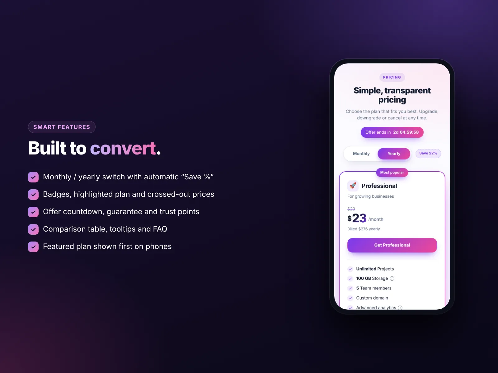
Add a “Most popular” or “Best value” badge, a stronger color or a raised card to the plan you want most people to choose. This simple highlight is one of the most effective changes you can make.
6. Use anchoring
A premium plan at a higher price makes the middle plan look reasonable. Crossed-out prices (“$49 → $29 launch price”) work the same way, as long as the original price is real.
7. Offer a yearly discount
A monthly/yearly switch with “Save 20%” improves cash flow and keeps customers longer. Show the monthly equivalent of the yearly price (“$24/month, billed yearly”) so the comparison is fair.
8. Use time-limited offers honestly
An offer countdown on the table or a countdown bar at the top of the page creates urgency for launches and promotions. Never fake it.
Tips 9–11: words and features
9. Lead with outcomes
“Get your site live in 7 days” says more than “5 pages, 2 revisions”. Put the outcome under the plan name, then list the details.
10. Keep feature lists short
Five to eight lines per plan is enough. Put the rest in a comparison table below the cards for people who want every detail, and use tooltips to explain terms without cluttering the card.
11. Make the button text specific
“Start my 14-day trial”, “Book the Growth package” or “Buy now – $29” beat a generic “Submit”. The button should say what happens next.
Tips 12–13: trust and objections
12. Add trust right under the plans
- A money-back guarantee line (“30-day money-back guarantee”).
- Short testimonials or a review score.
- Logos of clients or “Trusted by 500+ businesses”.
- Secure checkout and accepted payment methods.
13. Answer the top questions in an FAQ
Can I cancel? Can I switch plans? Is VAT included? What happens after I pay? Answering these on the page removes the last doubts. Use the same questions customers ask you by email.
Tips 14–15: mobile and checkout
14. Design for phones first
On phones, plans stack one under another. Show the recommended plan first so visitors do not have to scroll past the cheapest option to find it, and keep the switch and buttons large enough to tap. Our mobile-friendly Wix guide has more layout tips.
15. Let people pay without leaving the page
Every extra step loses buyers. A plan button that goes straight to your Wix checkout with the right plan and price is much stronger than “Contact us to buy”. If a plan needs a conversation, link to a booking page instead, for example with an online booking calendar.
Pricing page examples by business type
| Business | Plan names | What changes between plans | Highlight |
|---|---|---|---|
| Web design agency | Starter, Business, Ecommerce | Number of pages, store setup, SEO, support months | Business |
| Personal trainer | Single, 10-pack, Monthly unlimited | Number of sessions, price per session | 10-pack |
| Software / SaaS | Solo, Team, Agency | Users, projects, integrations, support | Team |
| Photographer | Mini, Classic, Full day | Hours, edited photos, prints | Classic |
| Cleaning service | Basic, Deep, Move-out | Rooms, extras like oven or windows | Deep |
| Online course | Self-paced, Coached, VIP | Feedback, live calls, community access | Coached |
Notice the pattern: plan names describe the customer or the result, the differences are easy to measure, and the highlighted plan is the one that gives most customers the best value and gives you a healthy margin. Start from the closest example, then adjust the details to your own business.
Pricing page checklist
- 3 plans, cheapest on the left, premium on the right.
- One highlighted plan with a badge.
- Monthly/yearly switch with “Save %”.
- Outcome line under each plan name.
- 5–8 key features per plan, tooltips for details.
- Comparison table below the cards.
- Guarantee, testimonials and payment icons.
- FAQ with the top 5–8 questions.
- Specific button text that goes straight to checkout.
- Recommended plan shown first on phones.
- Prices in your site currency, taxes explained.
- Tracking of views, clicks and orders so you can improve.
Build it on Wix in 15 minutes
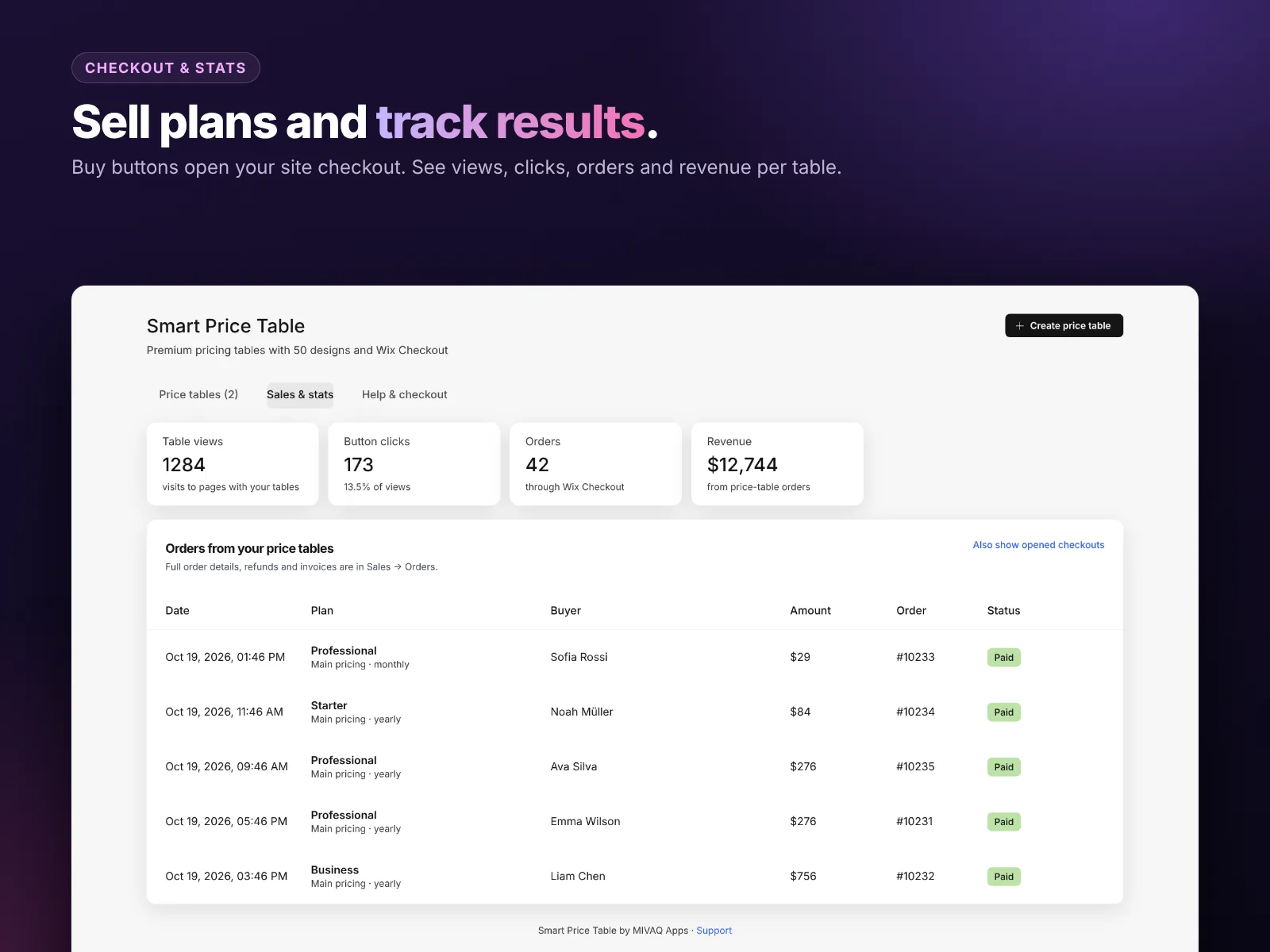
Every item in the checklist above is built into Smart Price Table: 50 premium designs, a live editor, a monthly/yearly switch with an automatic “Save %” badge, badges and crossed-out prices, feature tooltips, a comparison table, FAQ, guarantee line, trust points and an offer countdown. Buttons can open your Wix checkout for the chosen plan and price, and the app tracks views, clicks, orders and revenue for each table.
- Install Smart Price Table and start the 14-day free trial.
- Choose a design and enter your three plans.
- Highlight the main plan, add the yearly prices and the guarantee.
- Add your FAQ and comparison rows.
- Place the widget on your pricing page and publish.
It costs $2.99 a month, or $2.49 a month billed yearly. For a full tour of the app, read our guide to the best Wix pricing table app.
How to install Smart Price Table and leave a review
- Open the Smart Price Table listing on the Wix App Market.
- Click Add to Site, choose your Wix site and approve the permissions.
- Set it up from your Wix dashboard or the Editor (the steps above take a few minutes).
- Once it is working for you, go back to the app page, scroll to Reviews and click Write a Review. Choose your stars and share one or two sentences about how you use it.
Reviews help other Wix users find tools that work, and they help us, a small team, decide what to build next. If something is not working the way you expect, please tell us first and we will fix it fast.
More top Wix apps from MIVAQ Apps
MIVAQ Apps is the app studio of MIVAQ Creative Solutions. Every app is made for Wix, priced fairly and supported by real people. You can see all of them on our MIVAQ Apps developer page on the Wix App Market and on our Wix apps page.
- News Ticker & Announcement Bar: a scrolling news ticker and announcement bar with countdowns and coupon codes.
- Bulk Product & Price Editor: bulk edit prices, sales, stock, ribbons and SEO for many products at once.
- Smart Booking & Payment: a booking calendar with online payments, deposits, Stripe and PayPal.
- YMM Parts Finder: a Year / Make / Model parts finder and fit check for any kind of parts store.
Need help with your Wix site?
MIVAQ designs, builds and manages Wix websites and builds Wix apps. If you want help with your pricing strategy, pricing page design or checkout, we are happy to help. See our Wix solutions, then contact us:
- WhatsApp: message us
- Email: hello@mivaq.com
- Form: send your project details
Related Wix guides
- Best Wix pricing table app
- Wix store conversion tips
- Wix website design tips
- Wix pricing plans and memberships
- Wix marketing tools
Frequently asked questions
How many plans should a pricing page have?
Three plans work best for most businesses: a starter plan, a recommended main plan and a premium plan.
Should I show yearly prices?
Yes. A monthly/yearly switch with a visible saving encourages yearly plans and improves cash flow.
Where should the recommended plan go?
In the middle on desktop and first on mobile, with a badge like “Most popular”.
Should I add an FAQ to my pricing page?
Yes. Answering common questions about cancellation, upgrades and taxes removes the last doubts before buying.
How can I build a pricing table on Wix?
Use Smart Price Table by MIVAQ Apps: pick one of 50 designs, enter your plans and connect the buttons to your Wix checkout.
Can I test which pricing page works best?
Yes. Change one thing at a time, for example the highlighted plan or the button text, and compare views, clicks and orders in the table stats.